
Brand Apart
Beloved Benefit
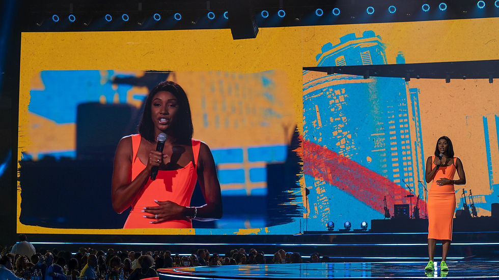
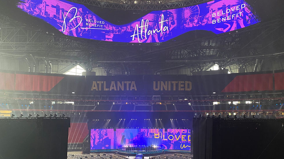
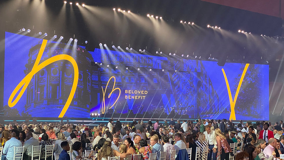
For the return of Atlanta’s Beloved Benefit, Brand Apart asked MAMMAL to design a fresh, urban-inspired motion graphics package for the event at Mercedes-Benz Stadium. We created a unified look across screens of all sizes by building loopable, modular animations that could adapt in real time. A large, animated brushstroke became the central design element, adding energy and cohesion while serving as a matte for transitions and content. The final package featured gritty, street-style backgrounds, flexible logo frames, and layered elements tailored for both live video and IMAG.
"Now I am become Death, the Destroyer of Worlds."
adapt
The main purple colorway was used to convey important information and served as the event's overall brand palette and style.

the process
In the next sections, we’ll share a behind-the-scenes look at our process from kickoff to completion, highlighting key decisions along the way. We'll explore character studies and art direction, all created using Adobe Illustrator and After Effects.
.png)
Solution
A limited color palette, 2 all-caps typefaces, and abstracted, 3D interpretations of the network logo serve as the cornerstones of Defy’s brand identity. The motion language of the network is snappy and dynamic, but with a subtlety that pulls you in and guides your attention to the shows’ content.


.png)


.png)


amplify
The vibrant red colorway was used to build excitement and energy leading up to performances.


aspire
The yellow colorway served as one of two Beneficiary Highlights. These moments shed light on the issues and inspired a brighter future.


PROCESS
Building a new network takes a lot, so we’re sharing a glimpse into our visual and conceptual process. Below, you'll see early explorations in typography, color, and art direction that shaped our direction.


Challenges + Solutions
Animated sequences of photos and documents were created to convey information and visually connect the investigative dots of the narrative. It was imperative that these graphics felt realistic and authentic to the story being told.

Title Sequence
The title design needed to be simple, clean, and focusing solely on the men whose lives were irrevocably impacted. MAMMAL adopted a minimalist approach, emphasizing emotional resonance by switching between old family photos to their mugshots. Similar to the document and photo sequences, the use of paper textures grounded the visuals, creating a raw and tangible connection to their stories.