The E.W. Scripps Co.
Defy | BRAND LAUNCH
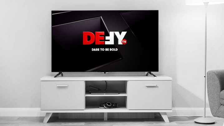
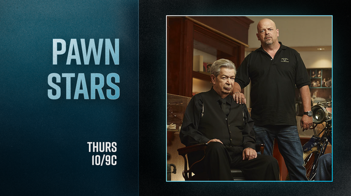
Dare to Be Bold. The E.W. Scripps Co.’s new network, Defy TV, is doing just that. Defy is a multi-platform network that provides premium, action-packed content that fearlessly confronts the norms of reality television. Scripps tasked MAMMAL with creating a brand identity that brings together thrill, adventure, craftsmanship, education, trade, and real-life people into one ultra-sleek package.
"Now I am become Death, the Destroyer of Worlds."
.png)
Challenge: Content
With Defy’s diverse programming, we needed a cohesive look that fit each A&E Original it features. The design system had to remain unified, grounded, and relatable.


Challenge: Audience
Defy's target demographic is men, which needed to be reflected in the branding; however, we also wanted to ensure that it would appeal to a broader audience. Early strategy work helped shape key decisions along the way.

Solution
A limited color palette, 2 all-caps typefaces, and an abstracted interpretation of the network logo serve as the cornerstones of Defy’s brand identity. The motion language of the network is snappy and dynamic, but with a subtlety that pulls you in.
SOLUTION
A limited color palette, 2 all-caps typefaces, and abstracted, 3D interpretations of the network logo serve as the cornerstones of Defy’s brand identity. The motion language of the network is snappy and dynamic, but with a subtlety that pulls you in and guides your attention to the shows’ content.
.png)
Solution
A limited color palette, 2 all-caps typefaces, and abstracted, 3D interpretations of the network logo serve as the cornerstones of Defy’s brand identity. The motion language of the network is snappy and dynamic, but with a subtlety that pulls you in and guides your attention to the shows’ content.
.png)
Typography
Sharp Sans Display No. 1 is a thick, cutting-edge typeface that wholly embodies the mantra of the brand in its design: it Dares to Be Bold. Rift is a condensed typeface. Clean, but expressive; adventurous, but grounded. Our goal was to find a balance between rugged and modern, without feeling exclusionary.
.png)

.png)
Color Palette
The Defy color palette consists of black, red, gradient gray, and white, with red as the hero color to convey boldness and confidence. Red is typically characterized as assertive, daring, and adventurous — all qualities which translate seamlessly across the board of Defy’s diverse programming.
.png)
.png)

.png)

Logo Lockup
The Defy logo was refined using a 60px grid to ensure consistent stem thickness and pixel-perfect animation. This lockup only appears in transitions, preserving the full 3D logo in bugs, stings, and IDs. From it, we built a system of rectangular bars—drawn from the E and reversed F—used as cursor-like devices to guide scenes.

.png)

Mockups
Typography, color, and the 60px grid were key in shaping Defy’s modern, sleek, and versatile brand. We aimed for a look that felt bold yet approachable, working seamlessly across network, promo, social, and out-of-home marketing. Guided by the “Dare to Be Bold” tagline, the result is a cohesive, adventurous identity built to captivate.


Toolkit
Using the Essential Graphics panel in After Effects, we built a custom, user-friendly toolkit to ensure our designs could adapt easily across future network, promo, and social needs. This snippet shows just a glimpse into the endless customization possibilities.


Process
Building a new network requires thorough ideation, so we’re sharing a glimpse into our visual and conceptual process. Below, you'll see early explorations in typography, color, and art direction that shaped our direction.
PROCESS
Building a new network takes a lot, so we’re sharing a glimpse into our visual and conceptual process. Below, you'll see early explorations in typography, color, and art direction that shaped our direction.

Art Direction
Early in concepting, we explored how masculinity could influence typography, texture, and motion—shown here in one of our first moodboards. Starting with Defy’s original blue and teal palette, we tested how color could shape mood. After several rounds of exploration, we landed on a style that truly reflects Defy’s mantra: Dare to Be Bold.

Color
3D dramatic lighting and shading brings our color palette to life with rich variation. Before finalizing, we explored extensively to find colors that captured the brand’s bold energy.


.png)
Styleframes
With type and color set, we focused on refining Defy’s visual identity. Using the grid system and 3D letterforms, we tested ways to highlight key content and guide the viewer’s eye. These ideas evolved through styleframes, helping us shape a final look.
.png)

Challenges + Solutions
Animated sequences of photos and documents were created to convey information and visually connect the investigative dots of the narrative. It was imperative that these graphics felt realistic and authentic to the story being told.

Title Sequence
The title design needed to be simple, clean, and focusing solely on the men whose lives were irrevocably impacted. MAMMAL adopted a minimalist approach, emphasizing emotional resonance by switching between old family photos to their mugshots. Similar to the document and photo sequences, the use of paper textures grounded the visuals, creating a raw and tangible connection to their stories.


