
The E.W. Scripps Co.
Truereal | BRAND LAUNCH
Real Life. Big Drama. That’s the promise of The E.W. Scripps Co.’s new network: TrueReal. Just as drama is a key component of the network’s diverse programming, Scripps tasked MAMMAL with creating a brand identity that is dramatic, modern, sophisticated, and pushes the boundaries of reality television.
"Now I am become Death, the Destroyer of Worlds."
.png)
Challenge: Content
TrueReal’s diverse lineup called for a cohesive look that complemented each unique show. Though most are A&E Originals, each needed to feel part of the TrueReal brand and fit seamlessly into the graphics system.

Challenge: Audience
TrueReal's target demographic is women, which needed to be reflected in the branding, but also needed a broader appeal. Prioritizing strategy early helped us understand the audience and guide key branding decisions.

Solution
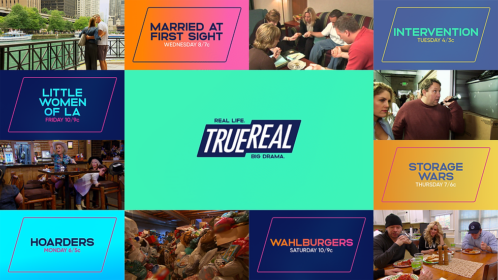
Four bold color themes and two geometric all-caps typefaces define TrueReal’s flexible, punchy look. Quick cuts and bold animation drive the motion language. By repurposing the logo shape, we built a graphic system using the backplate motif to frame content. Show footage appears within these shapes and typography, offering dynamic glimpses into TrueReal’s hit programming.
SOLUTION
Four bold color themes and two geometric all-caps typefaces define TrueReal’s flexible, punchy look. Quick cuts and bold animation drive the motion language. By repurposing the logo shape, we built a graphic system using the backplate motif to frame content. Show footage appears within these shapes and typography, offering dynamic glimpses into TrueReal’s hit programming.
.png)
Solution
Four bold color themes and two geometric all-caps typefaces define TrueReal’s flexible, punchy look. Quick cuts and bold animation drive the motion language. By repurposing the logo shape, we built a graphic system using the backplate motif to frame content. Show footage appears within these shapes and typography, offering dynamic glimpses into TrueReal’s hit programming.
.png)
Typography
Altero, a modern and sophisticated sans serif, serves as TrueReal’s primary typeface. Gilroy supports with strong, approachable legibility. Together, they strike a balance between modern and refined—without feeling flashy or cliché.


Color Palette
TrueReal’s palette includes 4 warm and 4 cool colors, forming 4 themes tailored to different show tones—from serious to upbeat. The hero theme, “Opulent Orange” (white, orange, pink, dark blue), captures the brand’s glamor and drama. The palette also features 4 gradients and 9 background options for added flexibility.
.png)


.png)


Backplate Motif
The logo backplate is central to TrueReal’s branding, creating visual “windows” for imagery, type, and color. Made of identical parallelograms, it can form a full-picture view or stand alone as a window—reinforcing brand recognition throughout.


Mockups
Typography, color, and backplate motifs shaped TrueReal’s stylish, flexible brand identity. Designed to work across network, promo, social, and out-of-home, the system stays grounded in the brand’s signature authenticity—resulting in a cohesive, relatable, and engaging look.


Toolkit
Using After Effects’ Essential Graphics panel, we built a custom, user-friendly toolkit designed for flexible use across network, promo, and social. Easy to navigate and endlessly customizable, it ensures the brand’s look translates smoothly across all future needs.


Process
Building a network from the ground up requires thorough ideation, so we wanted to take you through our visual and conceptual process. We like to showcase some of these behind the scenes moments in order to paint a larger picture of the decisions and thought processes that drove us. Below, we will take a look at some of our initial phases of typography, color, and art direction.
PROCESS
Building a new network takes a lot, so we’re sharing a glimpse into our visual and conceptual process. Below, you'll see early explorations in typography, color, and art direction that shaped our direction.

Art Direction
Our concepting was guided by three words: feminine, modern, and dramatic. We aimed for a look that was fun, fresh, and bold—reflected in early moodboards. After several rounds of exploration, we landed on a style that fully captures TrueReal’s mantra: Real Life. Big Drama.


Color
TrueReal’s versatile color palette was the result of extensive exploration to find hues that effectively express the brand’s wide range of emotions.

.png)


Styleframes
After establishing the type system, we focused on visual identity—using the backplate motif and repetition to highlight TrueReal’s dramatic tone. These ideas evolved through styleframes to shape the final brand vision.
.png)
Challenges + Solutions
Animated sequences of photos and documents were created to convey information and visually connect the investigative dots of the narrative. It was imperative that these graphics felt realistic and authentic to the story being told.

Title Sequence
The title design needed to be simple, clean, and focusing solely on the men whose lives were irrevocably impacted. MAMMAL adopted a minimalist approach, emphasizing emotional resonance by switching between old family photos to their mugshots. Similar to the document and photo sequences, the use of paper textures grounded the visuals, creating a raw and tangible connection to their stories.